Roses & Regrets

Heading

Roses and Regrets is my love letter to heartbreak the messy, dramatic, soft-core kind that deserves its own soundtrack. Designed for a fictional girl group called nostalchicks, this poster is drenched in romantic decay. Think bleeding roses, bittersweet songs, and petals that fall like bad decisions at midnight. It’s a visual sigh, a soft scream, and maybe a little too personal.

CLIENTS • 

Academic

Tools• 

Fresco, Illustrator, Photoshop

role• 

Designer

album cover thumbnail

🎯 Project Overview

Project Title:Roses and Regrets – Album Poster Design

Client: Fictional band nostalchicks

Genre: Heartbreak / Indie Pop / Sad Girl Autum

Scope: Concept development, visual storytelling, illustration, and layout design

Let’s set the scene: it’s 2AM, eyeliner smudged, the group chat’s gone silent, and your playlist knows you better than your therapist. That’s the world Roses and Regrets lives in.

I designed this poster as a promotional piece for the fictional heartbreak album by nostalchicks a dreamy, nostalgic girl band who write songs for people who reread old texts and pretend they're fine. The concept centers around a single rose in full bloom bleeding, not wilting because sometimes love doesn’t die, it just hurts louder.

The visuals with melodrama (bleeding petals, crimson smears, poetic gloom), but it’s all done with softness and control. I kept the background ethereal, like a faded memory, while the rose takes center stage beautiful, bruised, and totally not over it. Typography leans elegant, because even heartbreak deserves good kerning.

This poster wasn’t just about making something pretty it was about creating a feeling. One you’d want to hang on your wall, cry in front of, or maybe gift to your ex (but like, in a cute way).

Whether pinned to a bedroom wall or used in a digital rollout, this piece tells a story even without sound.

💡Ideation & Concept Direction

This project started, like most heartbreaks, with a feeling I couldn’t shake. I knew I wanted to create something dramatic—but not tragic. Emotional—but not cliché. Roses and Regrets had to feel like the moment you realize the love story is over, but the feelings are still echoing in the hallway.

🧠 The Brainstorm: I started by scribbling down words that made my chest tighten (in a romantic way):

| Faded love. Soft ache. Lipstick stains. Unsent texts. Echoes of “what if.”

From there, I built a concept around contrast—the soft and the sharp. A rose in bloom, but bleeding. Petals falling, but still gorgeous. Regret that’s heavy, but romanticized. It’s heartbreak wrapped in a velvet ribbon.

🌹 Symbolism Play:

  • Roses = love, passion, beauty that hurts if you hold it too tightly
  • Regrets = things left unsaid, timing gone wrong, that ache you revisit like a favorite sad song
  • Petals = memories drifting away, moments you can’t piece back together
  • Blood = raw emotion, but stylized—think poetic bleeding, not horror-movie gore

🎨 Color Moodboard:

  • Deep red (love and pain)
  • Dusty cream (memory haze)
  • Soft black (emotional weight)
  • Olive green (a nod to what's still alive in the aftermath)

🔤 Typography Mood:I wanted the text to feel like a soft-spoken confession. Something elegant, romantic, and a little old-school. A classic script for the title (because heartbreak deserves drama) and clean serif or sans-serif for the tracklist to keep things grounded. It’s emotional, but still curated.

✏️ Sketches & Ideation:

MOOD-BOARD:

red aesthetic moodboard filled with roses


SKETCHES:

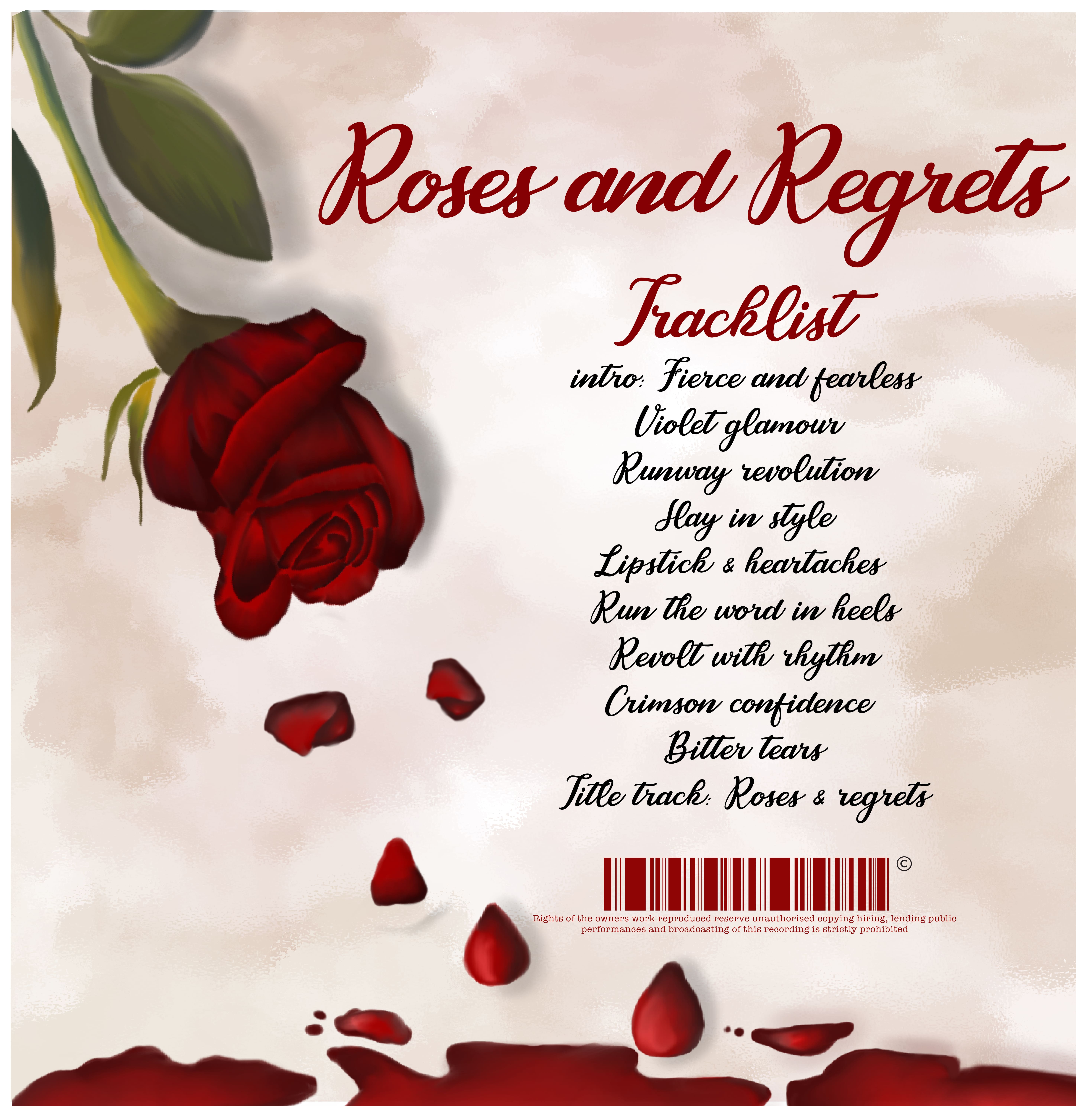
🌹 I started with some good ol’ pencil therapy sketching out the bleeding rose that would become the emotional anchor of the entire design.

🌹Picture this: A rose, still fully bloomed, but instead of gracefully wilting, it’s bleeding its heart out. I tried different versions where petals fell in dramatic arcs or pooled around the base like a scene out of a tragic love story but no matter what, the rose always stayed

bleeding rose sketchrose bleeding sketch rose and rose petals with title sketch


TYPOGRAPHY:

For the typography, I wanted it to whisper the same way the design does—softly, but with just enough weight to make you pause like you're on the edge of an emotional confession. The fonts had to be a dance between elegance and raw vulnerability, and the contrast of styles was key to giving the design its heartbeat.

Script Font for Intimacy:
The title Roses and Regrets needed to feel like a secret scribbled on the back of a napkin after a late-night conversation—personal, intimate, and dripping with unspoken emotions.
I went with a flowing Cassandra Personal Use Regular, because nothing says heartbreak quite like that soft, winding curve of a handwritten note.

It’s got that flowing, handwritten vibe, like something you’d scribble in a notebook late at night. The font feels elegant but a little messy, just like heartbreak—beautiful but imperfect.

FEEDABACK


Professor Leanna Palmer's Feedback:

"Love the bleeding rose concept it's raw and powerful! The choice of Cassandra Personal Use Regular is spot-on for that handwritten, intimate vibe. Just be mindful of the letter spacing; it’s a little tight in places.

Loosening it up a bit will help the title breathe while keeping that emotional punch. Overall, it’s coming together beautifully—keep that balance of elegance and vulnerability!


F‍

final album cover for roses and regrets final album cover for roses and regrets back


Mockups:

album cover mockupalbum cover mockup


Key Learning

Visual Storytelling:
This project taught me how to pack emotion into every detail. From the bleeding rose to the falling petals, I learned the power of symbols in conveying deep feelings—every element should serve the story.

Technical Takeaways:
I got better at balancing typography with imagery. Finding the right font (like Cassandra Personal Use Regular) and adjusting spacing to make it feel intimate, not crowded, was key. Layouts and composition need constant tweaking to get the perfect flow.

Aesthetic Voice:
This project helped me fine-tune my style of mixing softness with raw emotion. I learned that simplicity and elegance can carry a lot of weight, which is something I’ll keep exploring in future projects.